Equity Mining Tool (EMT)
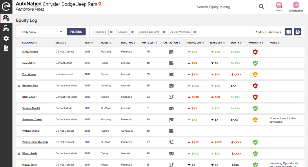
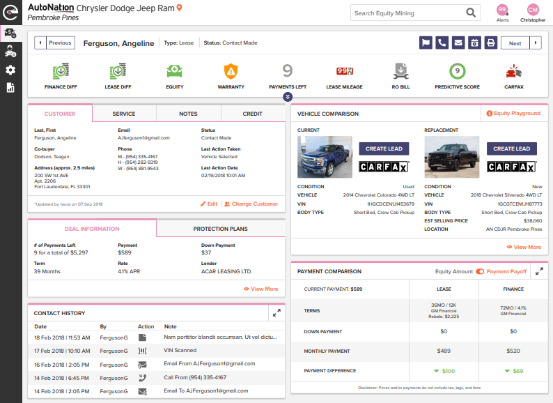
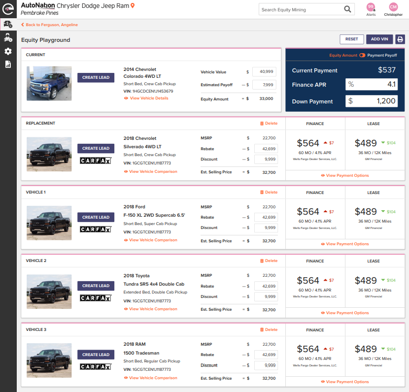
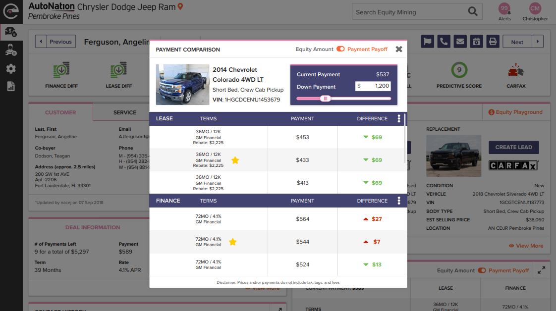
Description
AutoNation
2018
Internal Lead Generation Tool Redesign